
The Challenge
Bounce is a luggage storage service that allows travelers to store their belongings in safe locations while exploring a city.
The checkout flow is one of the most critical steps in the user journey — it's where conversion actually happens. However, the existing flow had friction points that were causing users to drop off before completing their booking.
The opportunity: Identify and remove friction in the checkout flow to maximize funnel conversion and capture latent revenue.
My Role & Approach
As Product Designer, I conducted a focused audit of the checkout flow to identify friction points and opportunities for improvement.
- Lightweight & fast: A focused heuristic intervention, not an expensive full redesign.
- Evidence-driven: Prioritizing UI and copy changes based on behavioral patterns and impact vs. effort mapping.
- Actionable: Delivering high-impact, low-scope design recommendations for rapid development implementation.
Discovery & Audit
I executed a heuristic evaluation and competitive benchmarking across the checkout journey to isolate 8 core areas of opportunity:
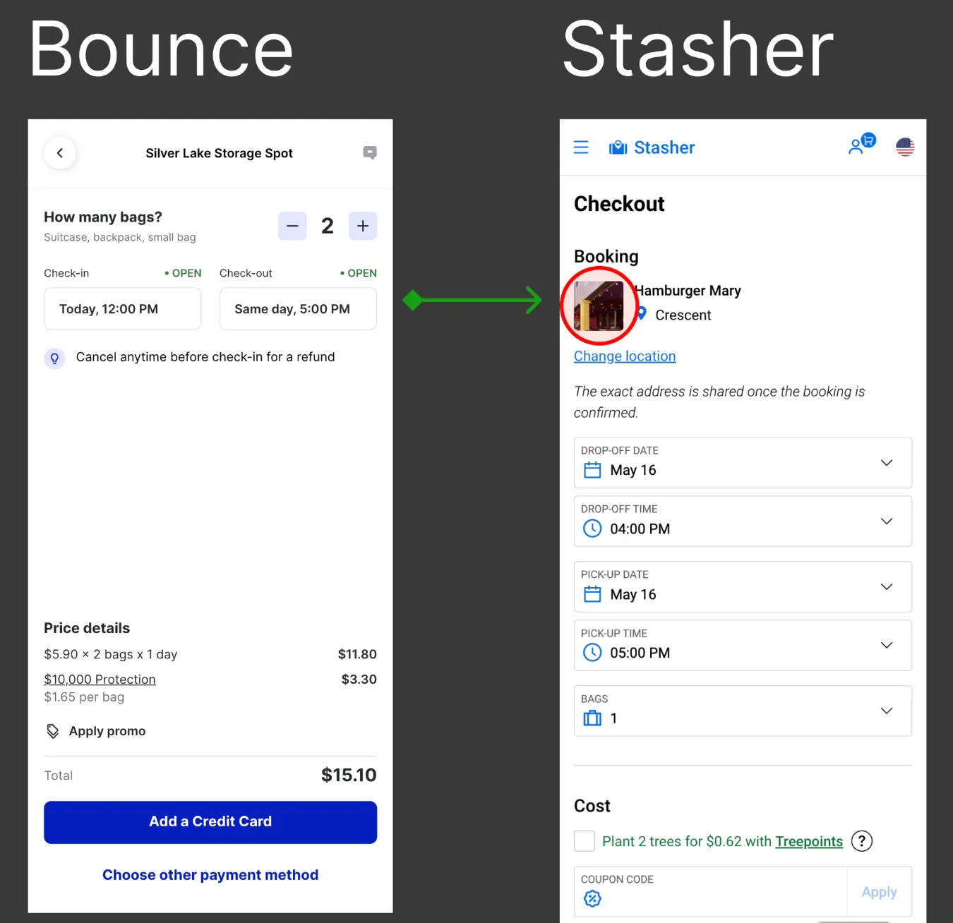
1. Maintain Visual Context of the Selected Location
The problem: Upon entering the checkout flow, the interface stripped away all visual cues of the user's selected storage location. This forced users to rely on memory (recall over recognition), drastically increasing cognitive load and checkout anxiety regarding location accuracy.
The solution: Embed a persistent visual thumbnail and summary of the selected spot throughout the transaction journey, mirroring industry best practices to provide immediate micro-reassurance and prevent back-button abandonment.
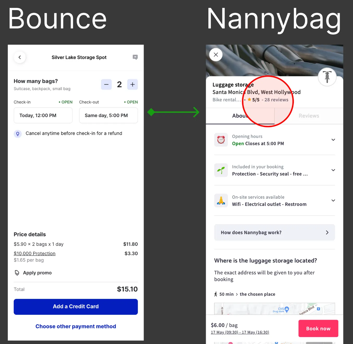
2. Leverage Persistent Social Proof to Build Trust
The problem: The transaction interface completely lacked validation mechanisms during the highest-friction moment of the user journey. By hiding reviews and ratings, the design missed a critical opportunity to mitigate purchase hesitation and anchor user trust.
The solution: Integrate persistent trust indicators—such as review counts and star ratings—top and center within the checkout view, aligning with verified industry benchmarks to reinforce confidence right before the final conversion trigger.
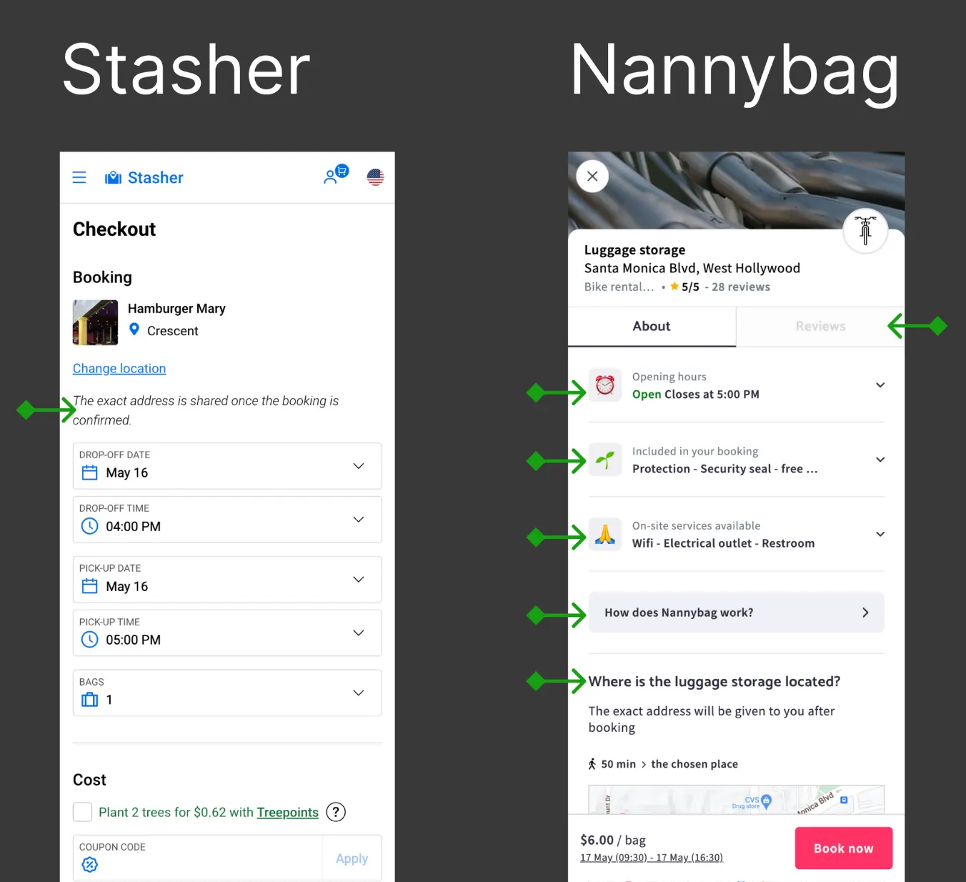
3. Ensure Continuous Access to Core Product Attributes
The problem: Transitioning into the checkout stage created an information vacuum, stripping away vital contextual details regarding the selected location. This lack of transparency triggered user second-guessing, driving high drop-off rates as users backtracked to verify core features.
The solution: Maintain immediate availability of key reassurance vectors within the checkout architecture to solidify transactional transparency:
- Approximate location anchor: Clear neighborhood or partial address validation.
- Security & protection tier: Visible security seals and structural safety guarantees.
- Operational clarity: Quick access to spot amenities, opening hours, and service mechanics.
- On-demand feedback: Accessible user reviews through progressive disclosure patterns.
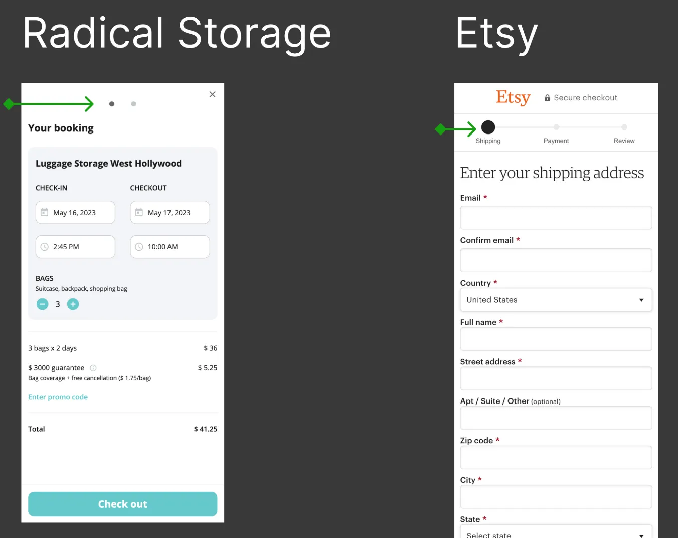
4. Implement an Illusion of Progress to Reduce Drop-offs
The problem: The transaction interface failed to communicate the user's position within the funnel, violating the core usability principle of visibility of system status. This lack of structural feedback increased perceived waiting time, causing user fatigue and hesitation.
The solution: Integrate a clear, step-by-step progress indicator to leverage the Goal-Gradient Effect. By visually chunking the transaction into sequential milestones, the journey feels faster, reducing cognitive friction and driving users toward flow completion.
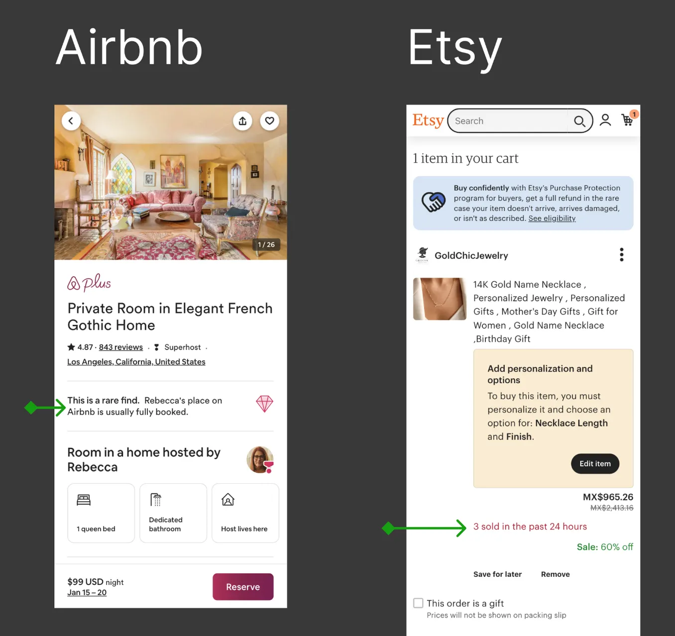
5. Deploy Scarcity and Urgency Cues as Behavioral Nudges
The problem: The checkout experience lacked motivational triggers, allowing users to exit the funnel without any perceived consequence of delay. Without contextual urgency, the interface failed to accelerate transaction intent at critical decision-making nodes.
The solution: Introduce strategic scarcity elements (e.g., "Only 2 spots left today") and real-time social validation data (e.g., booking velocity trends) to leverage the Scarcity Heuristic. These micro-nudges build low-friction urgency, significantly lowering funnel drop-offs and accelerating purchase intent.
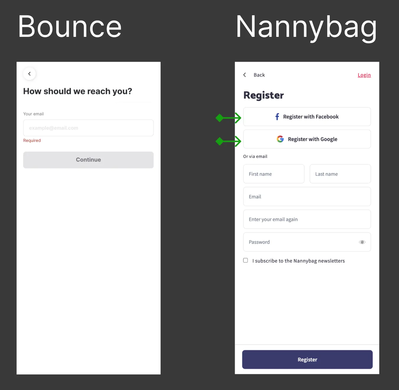
6. Integrate Social Auth Protocols to Eliminate Authentication Friction
The problem: The interface forced users through a manual, high-friction authentication gate right in the middle of the conversion path. Requiring manual data entry or traditional account creation created an unnecessary barrier that disrupted transaction momentum.
The solution: Implement third-party single sign-on (SSO) options—such as Google and Apple OAuth—to leverage existing device authentication states. Providing streamlined social auth alternatives dramatically reduces interaction friction and accelerates checkout velocity.
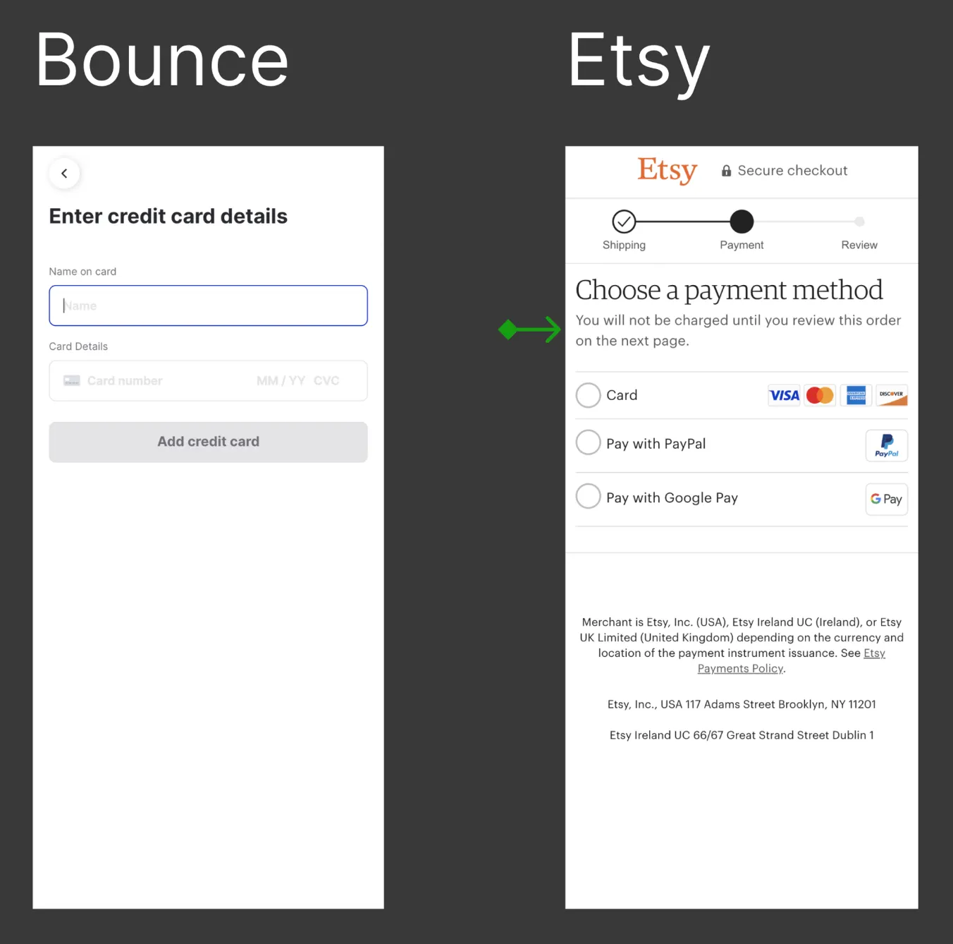
7. Introduce Microcopy Architecture to Embed Trust Signals
The problem: The primary H1 checkout heading lacked explicit contextual validation, creating a transactional cold-start effect. Without immediate reassurance regarding billing mechanics, users experienced friction and hesitation at the final point of payment entry.
The solution: Implement a supporting microcopy pattern directly beneath the H1 anchor—mirroring proven e-commerce design frameworks. This micro-narrative provides immediate cognitive reassurance (e.g., "You won't be charged until you review your final order"), neutralizing transaction anxiety and stabilizing checkout completion.
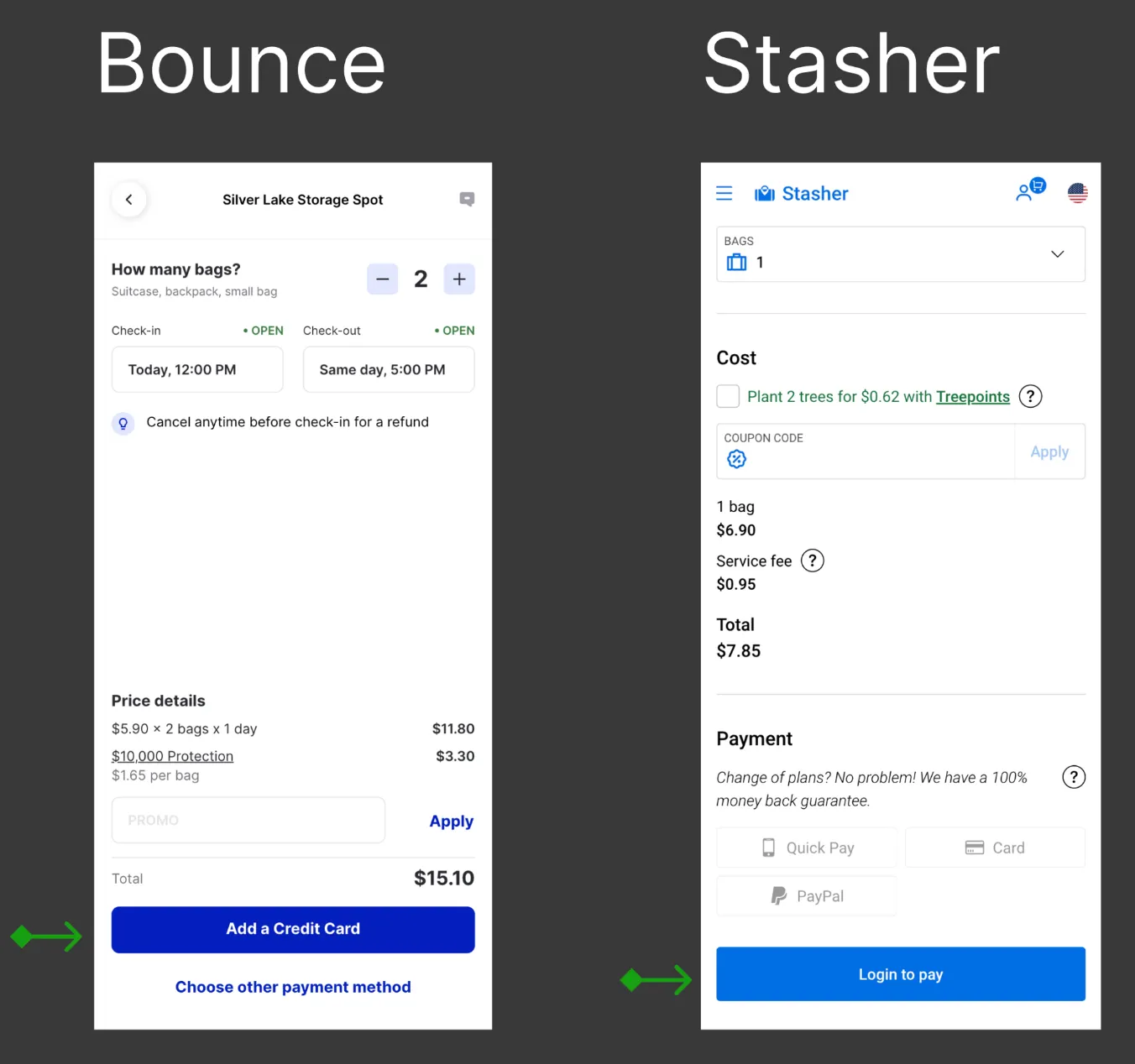
8. Align Call-to-Action (CTA) Mechanics with User Mental Models — THE WINNING CHANGE
The problem: The primary interactive trigger created a severe expectation violation within the conversion funnel. When users clicked "Add a credit card," their mental model prepared them for payment entry; instead, they were abruptly redirected to a mandatory account registration screen. This unexpected interaction mismatch triggered high cognitive friction and immediate funnel abandonment.
The Solution: Optimize the CTA architecture by rewriting the action copy from a premature backend command ("Add a credit card") to a transparent progression anchor (e.g., "Continue to payment" or "Book now"). This simple refinement aligns the interface with the user's intent, ensuring the next interactive state mirrors exact behavioral expectations.
Why This Delivered High-Impact ROI:
- Minimal engineering overhead: A low-scope, instantaneous string replacement that required zero modifications to the underlying transactional codebase.
- Funnel optimization: It targeted and resolved a maximum-friction drop-off trigger at the absolute core of the checkout journey, unblocking user momentum to directly generate the +8% conversion rate lift.
Strategic Prioritization
While all 8 optimization opportunities were valid, recommendations were prioritized using an Impact vs. Effort framework. The primary objective was to target the severe misalignment between active user expectations and interface feedback.
To optimize product development velocity, solutions were classified into structural overhauls and immediate operational wins. By focusing heavily on high-impact, low-scope iterations first, the business could unlock immediate conversion value without straining engineering capacity or altering underlying backend logic.
Business Results
The strategic copy and CTA alignment yielded an immediate +8% increase in net funnel conversion. This outcome serves as a clear indicator that precise behavioral design interventions generate outsized financial returns when they directly resolve a maximum-friction drop-off point.
Business Implication: Within a high-volume transactional model like Bounce, an +8% conversion rate lift drives compounding revenue expansion. This optimization required negligible engineering overhead and provided an immediate, frictionless return on design investment.
Additional Optimizations Shipped
Beyond the primary copy intervention, consecutive UI refinements were implemented to establish a cohesive, transparent, and high-trust transaction environment:
- Continuous Visual Reference: Embedding persistent location context to drastically reduce cognitive load and backtracking behavior.
- Persistent Social Proof Indicators: Keeping star ratings and historical review counts visible to anchor trust right before the payment trigger.
- Contextual Urgency Mechanisms: Deploying strategic scarcity cues to incentivize checkout momentum and accelerate active purchase intent.
Key Learnings
- Transactional Predictability Drives Conversion: Expectation alignment is the foundation of trust. Interfaces must feel predictable and reliable. When a product violates interaction expectations at critical funnel checkpoints, user trust erodes instantaneously, driving immediate friction and conversion drop-offs.
- Outsized ROI in Micro-Optimizations: Radical overhauls are not always the answer. A simple, low-scope copy refinement and layout adjustment delivered a net +8% conversion lift. This proves that precision behavioral design can unlock immense business value with zero technical overhead.
- Mitigating Anxiety at High-Friction Nodes: The transaction flow is where the highest emotional friction occurs because user commitment is requested. Prioritizing design interventions at these maximum-anxiety decision nodes yields the most direct and measurable impact on business revenue.
- Audit First, Speculate Later: Running a lightweight, heuristic audit allows product teams to rapidly isolate high-impact, low-effort opportunities. Grounding design strategies in behavioral evidence rather than visual speculation prevents wasted engineering cycles and accelerates time-to-market.